Utilising the F-pattern in web design
What is the F pattern?
In the late 19th century Louis Émile Javal was the first to discover that while reading, our eyes do not move continuously along a line of text, but they tend to jump across it and stop along each line in fixations.
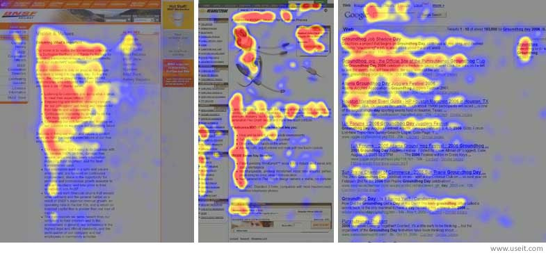
Fast forward to 2006, in a study done by the consulting company Nielsen-Norman Group, it was found that people do not read web pages linearly word by word, but they read them in an F-shaped pattern.
In this scanning pattern most of the fixations are concentrated at the top and left of the page. The users first read in horizontal movements which form the F's top bars and then they scan the content's left side in a vertical movement which forms the F's stem.
The implications of this pattern are:
- The first lines of text on a page receive more fixations than subsequent lines of text on the same page.
- The first few words on the left of each line of text receive more attention than subsequent words on the same line.
Why do people scan in an F-shaped pattern?
People scan in an F-shaped pattern if each of the three elements below is present:
- The page contains text that has very little or no formatting for the web. For instance, it doesn't have subheadings, bullet points or parts in bold, so it forms a block of text.
- The user is trying to be most efficient on that page.
- The user is not so focused or interested in reading every word.
The last two elements describe almost all web behavior: most web users prefer to complete their tasks in the fastest way and with the minimum amount of effort; they usually don't want to educate themselves and prefer to find a quick answer.
How to use the F-shaped pattern in web design
- Prioritise and format text to direct users to what you want them to see and what you know they want to see.
- Include the most important points in the first two paragraphs on the page.
- Use headings and subheadings. Make sure that the users will distinguish them quickly by making them look more important and visible than the normal text.
- Put the words that carry most information in the beginning of the headings and subheadings. The users should get the gist of the following section by reading only the first two words.
- Visually group small amounts of related content — for example, you can surround them with a border or use a different background.
- Bold important words and phrases.
- Make sure that the links include words that carry information (instead of generic “go”, “click here” or “more”). This technique also improves accessibility for users who hear links read aloud instead of scanning the content visually.
- Use bullets and numbers to call out items in a list or process.
- Remove unnecessary content.
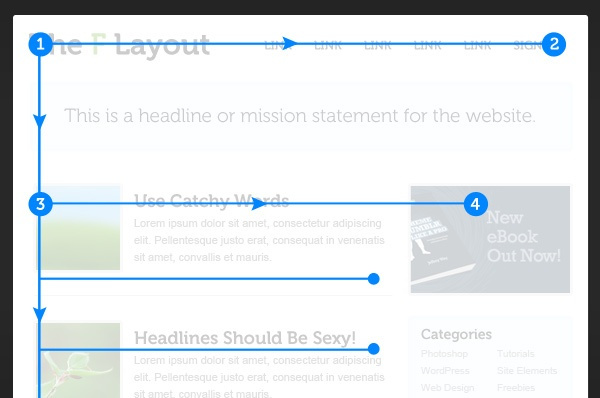
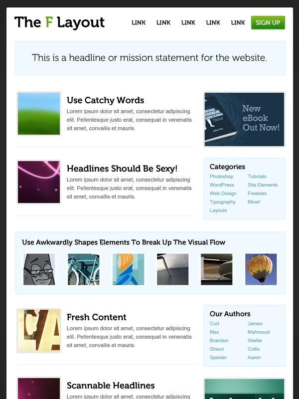
Example of F pattern design in action
Let's put these tips into action by sketching an example website.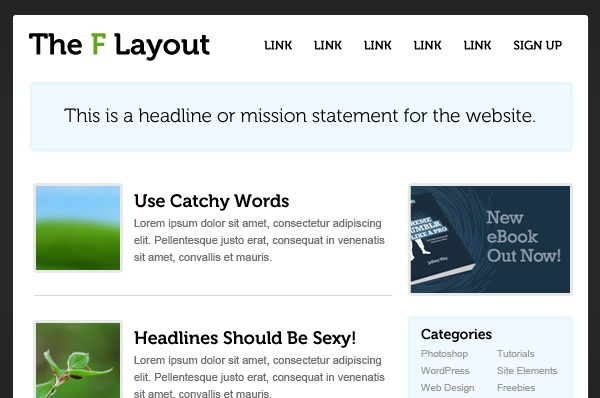
Is the F-shaped pattern relevant on mobile?
There is a Google study that some commentators are using to claim that F-Pattern doesn't apply to mobile devices. This study is concentrated in the effect of "answer-like" search results that come from Knowledge Graph and Google Instant.
Since people get answers without clicking a link, the click-through rate it is not an accurate measure of user satisfaction and search relevance. So, the researchers studied where users looked on their smartphone screens and found that:
"…68 percent of attention is given to the top half of the screen and 86 percent of attention is given to the top two-thirds of the screen."They also found differences between the focus of the attention in mobile devices and in desktop devices.
However, those findings are relevant for search result pages only and they do not extend to other types of pages. So for now, the F-Pattern still holds for most web content, independently of device.
Change is coming though. New technologies are being developed to "allow text to know if and how it is being read" by combining artificial intelligence and eye-tracking technology. Making the text responsive could completely change our online reading experiences and patterns.
Other scanning patterns
The F-shaped pattern isn't the only scanning pattern. There are many other possible scanning patterns, such as the ones listed below:
- The Layer-cake pattern consists of scanning the headings and subheadings and skipping the normal text below them. The heat map of this behaviour looks like a cake with alternating layers.
- The Spotted pattern occurs when the eyes skip big chunks of text and scan as if looking for something specific, such as a link, digits, a particular word or a set of words with a distinctive shape (such as an address or signature).
- The Marking pattern consists of keeping the eyes focused in one place as the mouse scrolls or finger swipes the page. This pattern happens more on mobile than on desktop.
- The Bypassing pattern involves skipping the first words of a line when multiple lines of text in a list start all with the same word(s).
- The Commitment pattern occurs when people fixate almost everything in a page. This happens when they are highly motivated and interested in the content. However, it doesn't happen very often, as most users will be scanning.
Conclusion
Scanning on the web is dictated by:
- User's motivation
- Goals they are trying to achieve
- Layout of the page and formatting of text
- Page content
People's motivation and their goals are hard to control, but the content and presentation can be optimized so that users can find what they want quickly. Since people scan in an F-shaped pattern, we can use web formatting techniques that match up with the F-shape to draw attention to the most important information instead of relying on the arbitrary words that people may fixate on while they're scanning the content.